ABOUT
The palace within is the concept that stands behind the name Regalia. Luxury is a word.
WHAT WE DID ?
Concept, Brand Identity, Outstanding design
FUNCTIONALITY
A boutique with so many beautiful and cozy, still elegant things to offer must have a strong but grateful image. When Regalia whished us to create their blazon we were like we have been touched by the proud aura of royalty from a far-off land. And the land was of our dreams, our imagination and our creative strength. Within an instant we knew that our new mission was to bring home all the grace from a so far across the seas dreamland. We’d like to think that by creating a unique and exhaustive identity for our highness we have become the deserving/honest/brave Knights of the Regalia Home.
CHALLENGES
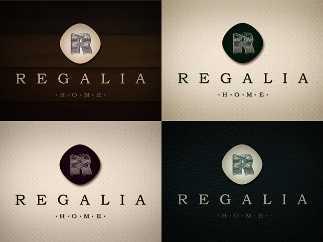
Bringing a kingsize dream to reality is definitely not an ordinary job. Actually ordinary and royal are words you will never find in the same sentence (!). Regalia s emblem has a clean and elegant design made of a symbol and a high-class logotype. Sophisticated calligraphy of the letter ”R” symbol visually emblematizes the idea of luxury, nobility and royalty. Angled at 45 degree the round corners square enclosing the ”R” acts both as a blazonry and as strong chromatics background meant to highlight the 3D wire frame Regalia symbol. For the ”Regalia Home” logotype we have chosen serif, Bookman Old Style an high-toned font style. In order to emphasize the quality of the products that we are promoting the letters constituting the ”Home” fraction were interlaced with five stars, the ultimate standard of high quality.
TECHNOLOGIES
- Adobe Illustrator
- Adobe Photoshop


